PORTFOLIO SAMPLES May 2026
Here are a few samples for you, including my copywriting work with small teams, so you can see my own style and approach. Please treat these samples with complete confidentiality. Thank you.
BRAND & MARKETING


For Asprey, I wrote product copy and ads, such as these, aimed at people shopping for gifts for a male partner, family member or friend. I employed an overtly ‘masculine’ tone, appealing to a sense of adventure that’s in harmony with the products.
BRAND POSITIONING & MARKETING: RESIDENTIAL

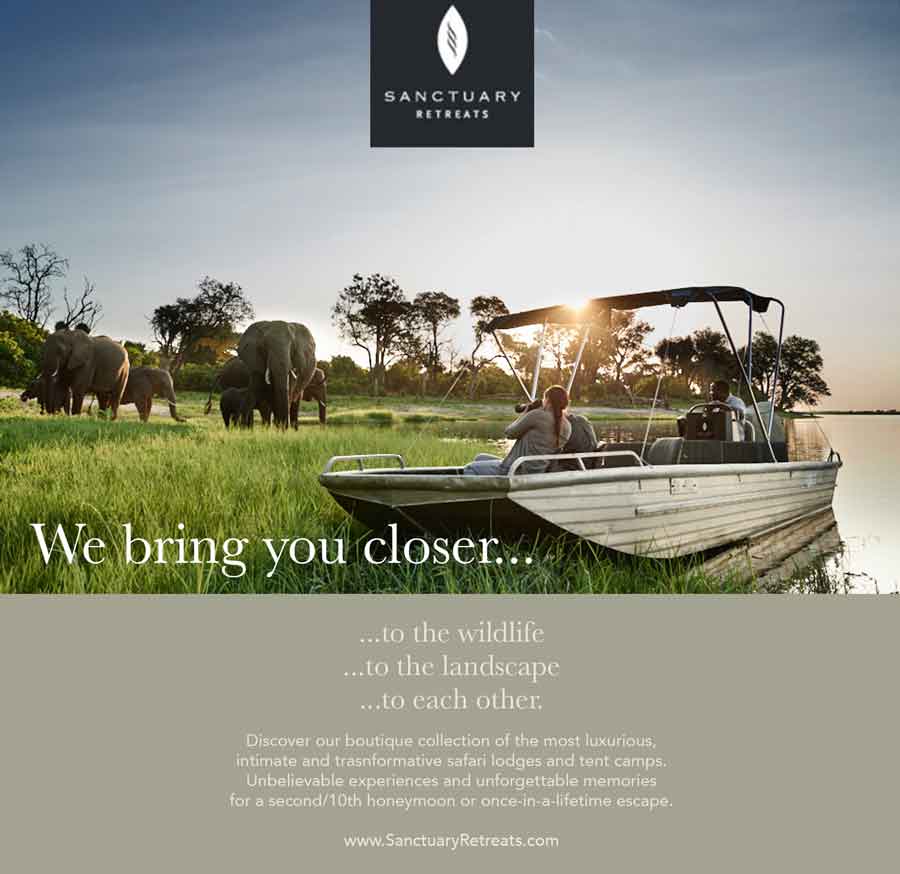
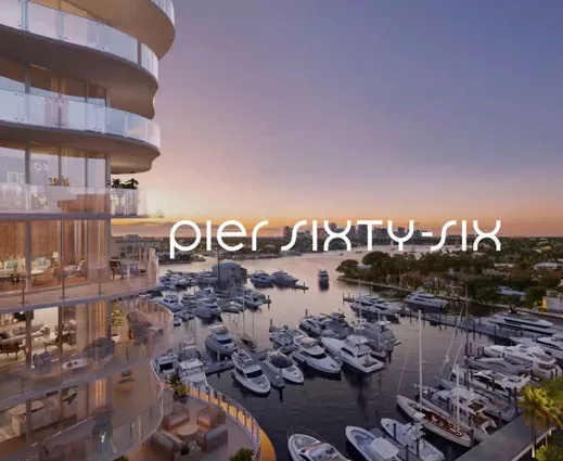
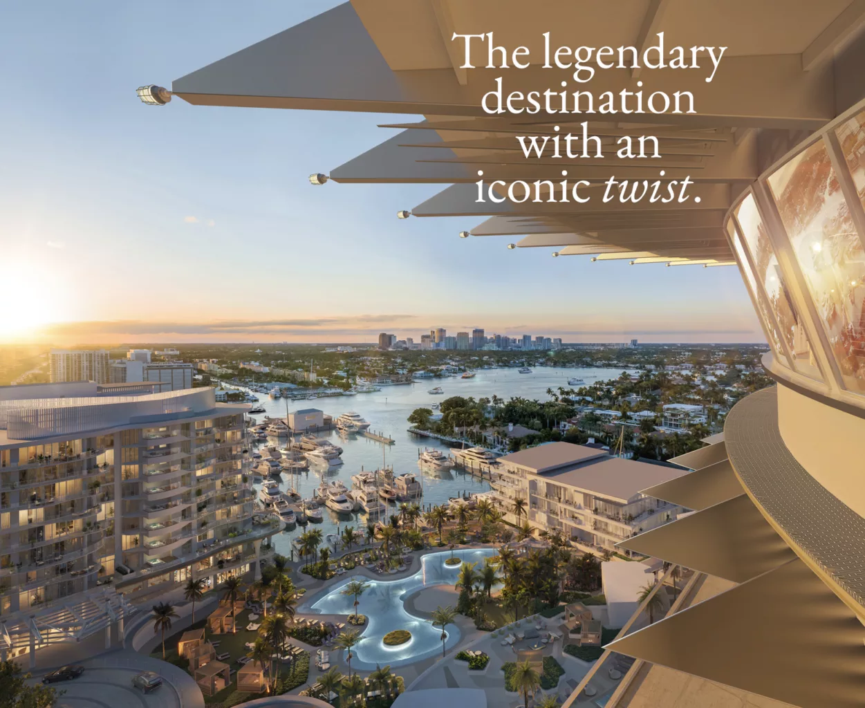
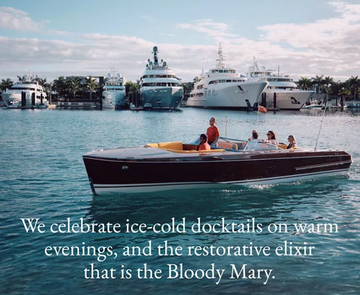
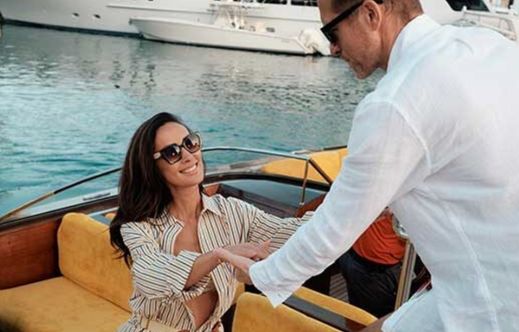
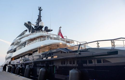
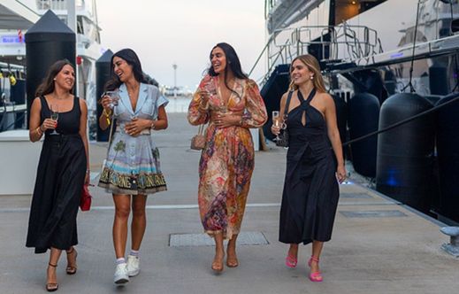
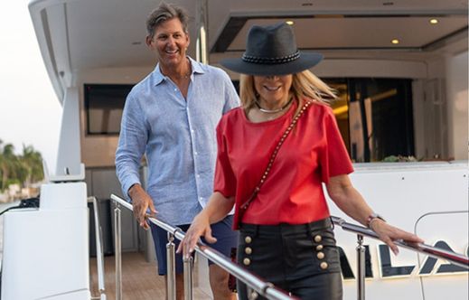
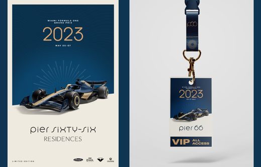
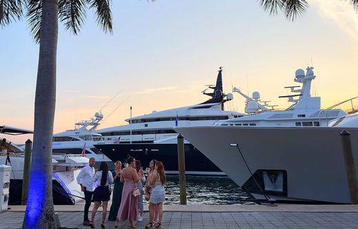
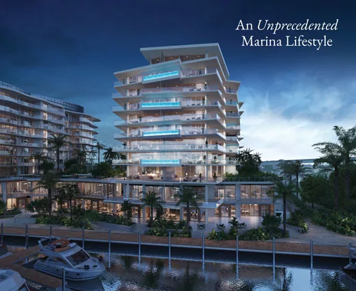
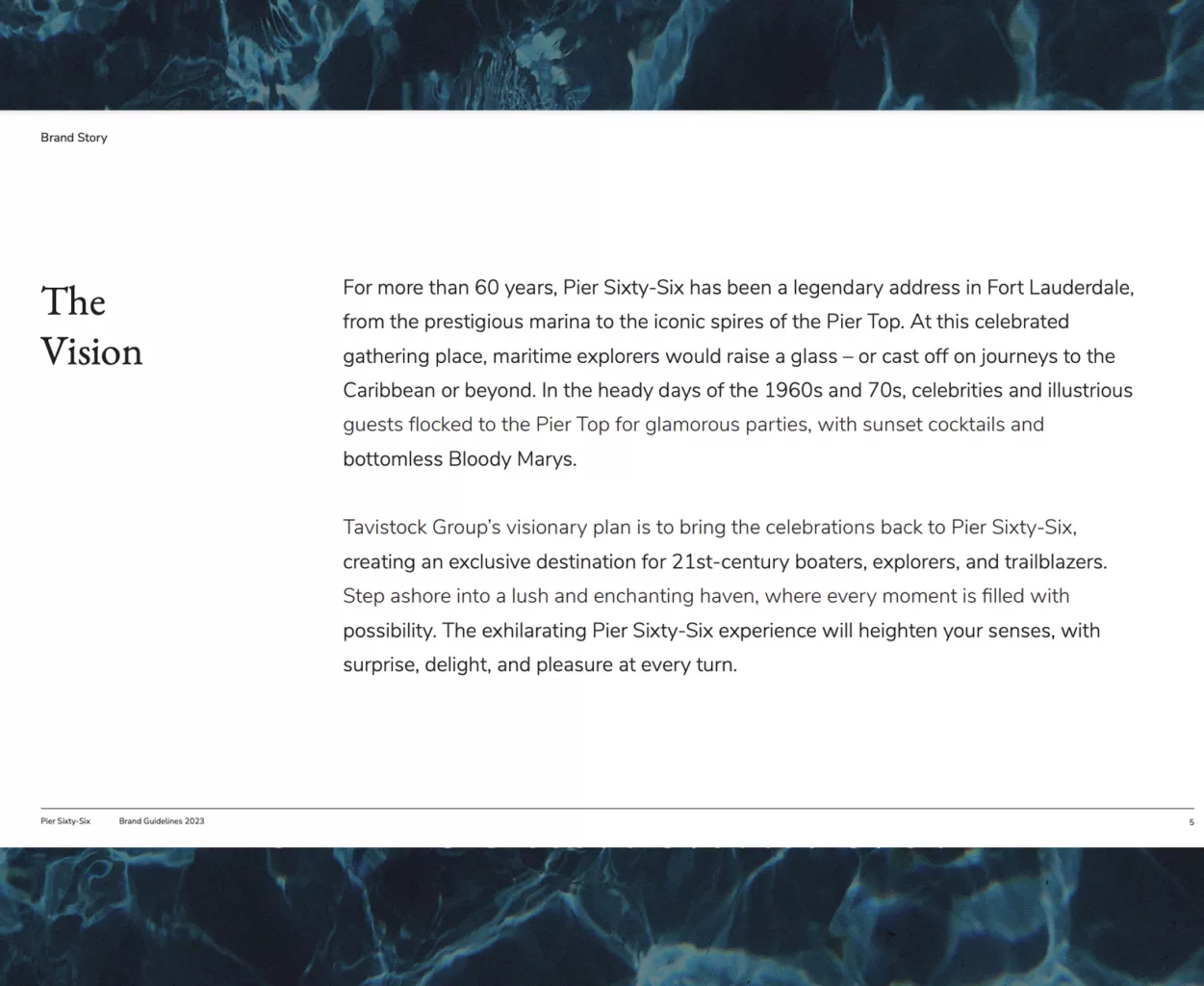
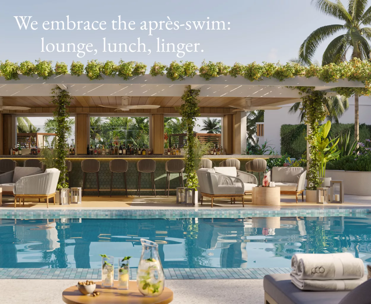
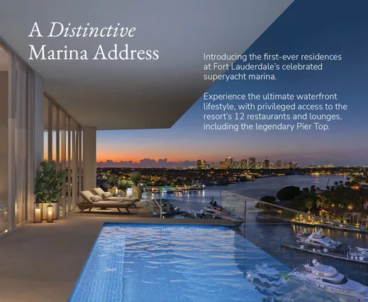
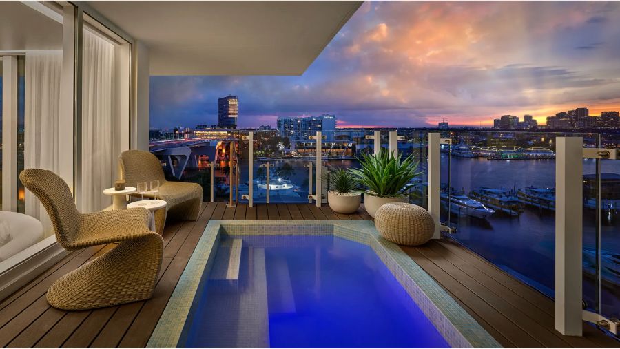
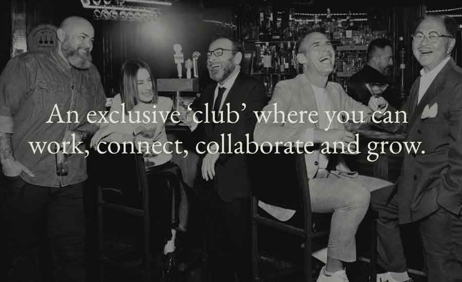
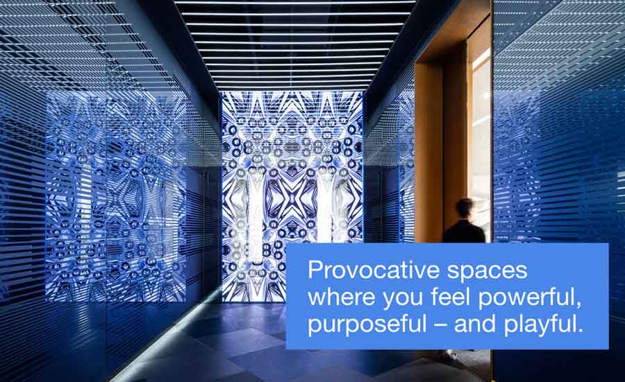
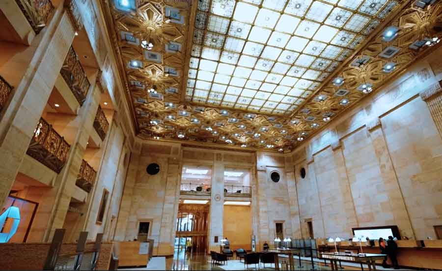
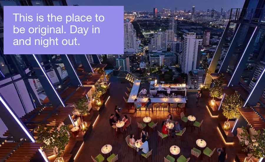
I worked extensively with Signature Creative in LA on luxury property development Pier Sixty-Six in Fort Lauderdale, Florida. We brought to life the essence of this reimagined heritage brand, which encompasses a superyacht marina, limited-edition waterfront residences and a revitalised resort. We cover the marina lifestyle from restaurants and the spa and private club to events from F1 to The Fort Lauderdale International Boat Show. I wrote the brand and TOV guidelines, websites, printed brochures, video scripts, and marketing materials, including social ads.


SEO-RICH BLOGS
I also wrote editorial and ads for South Florida and yachting magazines and SEO-focused blogs. One was about the fascinating history of Fort Lauderdale’s Venice-inspired canals, another on the architecture and history of the revolving Pier Top Lounge, including its place in Googie Design history, one on the psychological benefits of living near water, and others on local events, such as the Miami F1 and local eateries with dock-and-dine service for yachts.


BRAND REPOSITIONING
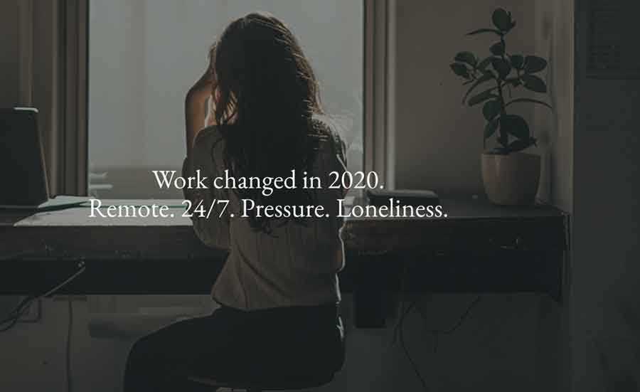
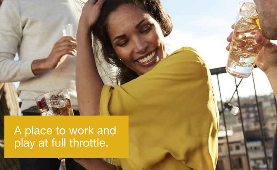
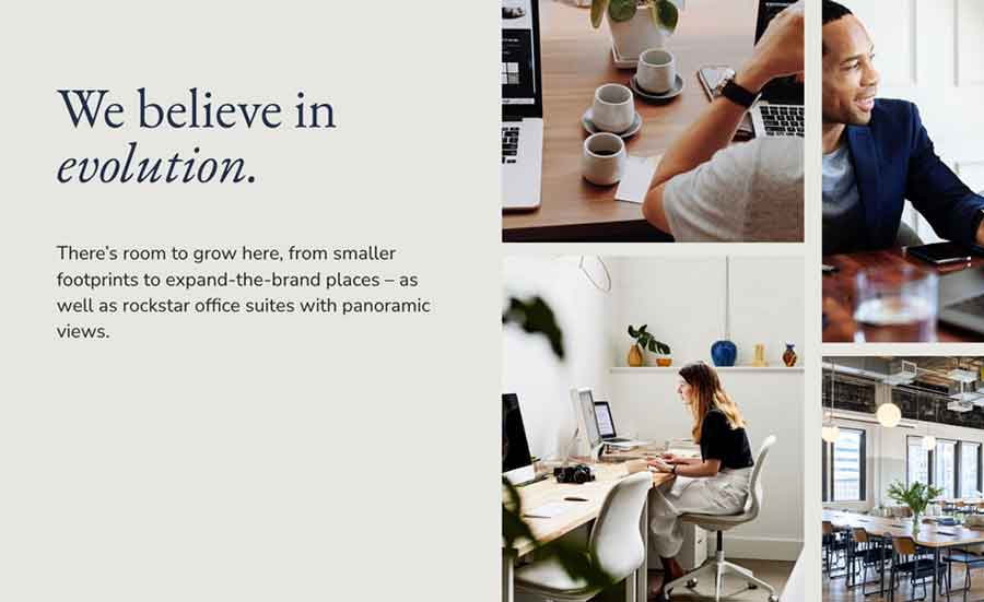
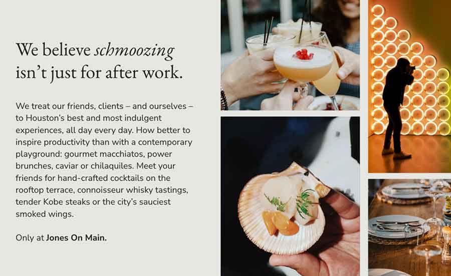
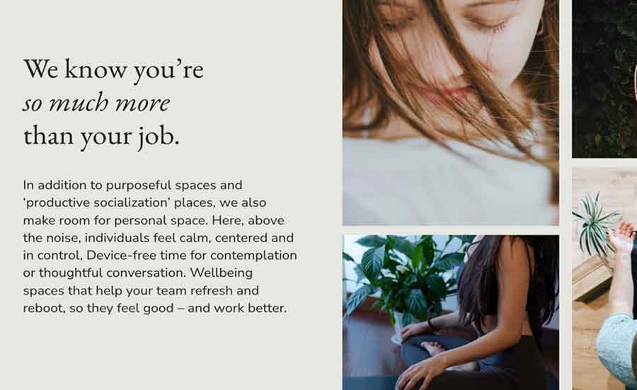
This B2B project was for property developers who’d recently purchased a central Houston office complex. I worked with Signature Creative in California on potential routes for rebranding and major renovation. Post-COVID, there is still a crisis re getting people back into the office, which means a crisis for commercial property developers. This historic property needs to focus on the benefits to business in having people on-site: and attractions that could entice employees back into the office more days of the week.

BRAND & MARKETING
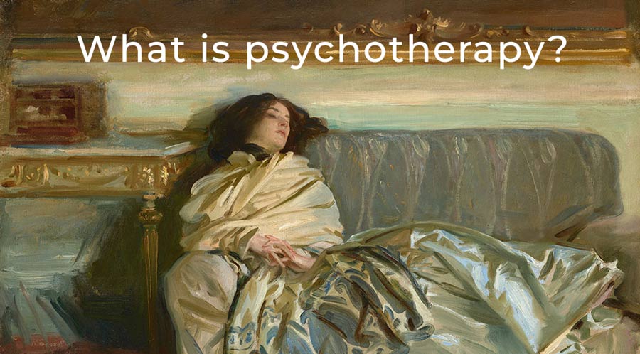
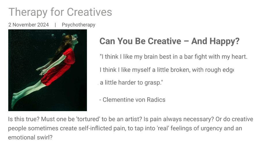
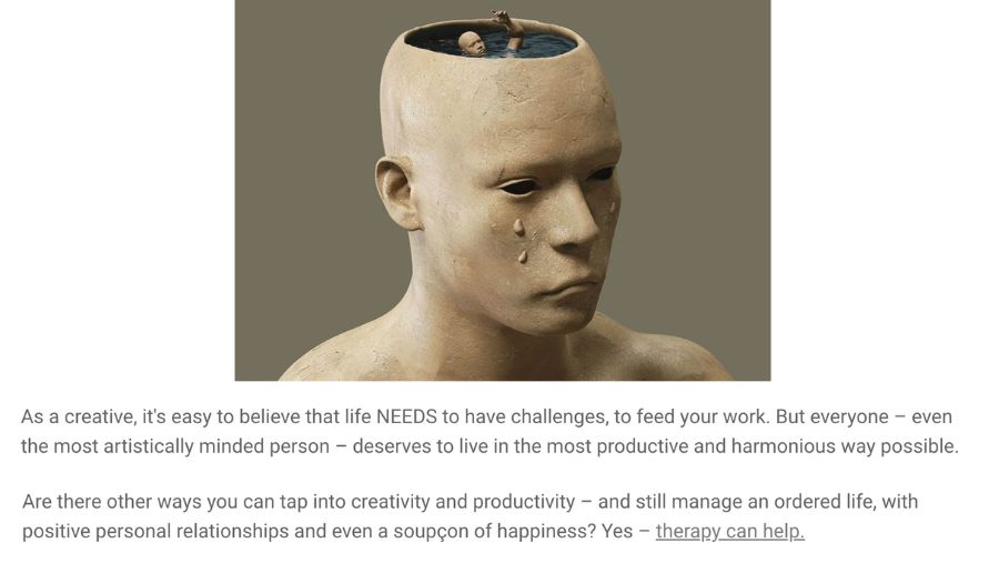
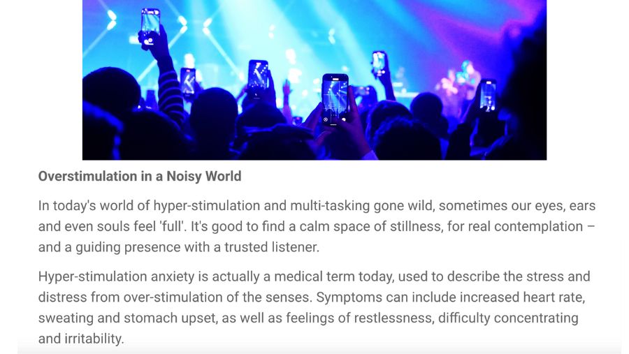
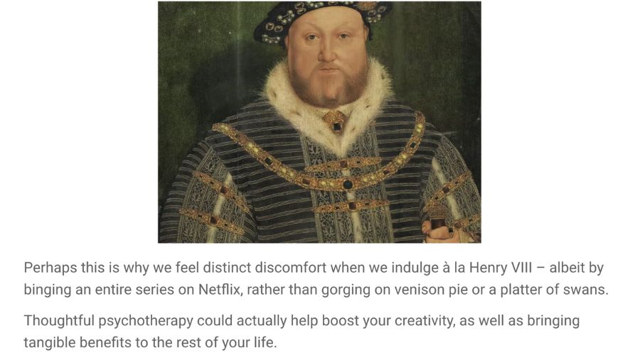
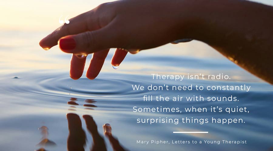
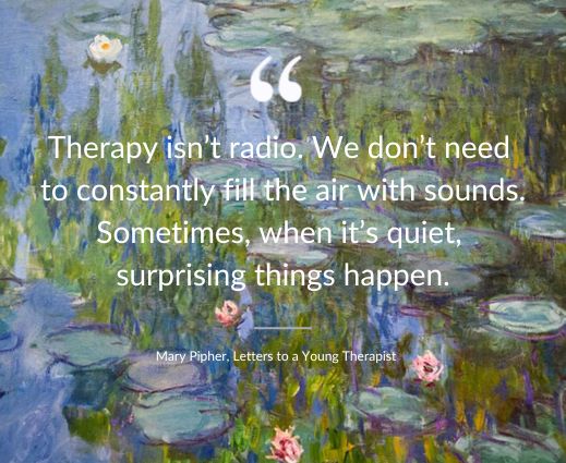
Working alone, I recently created a new website and materials for a psychotherapist in London Bridge, a cultured and intelligent practitioner who works with clients who are leaders in business and the world of culture. I included four introductory blogs about therapy, addressing topics such as therapy for creatives (including facing the fear that emotional struggles are ‘necessary’ to fuel your work).


BRAND TOV
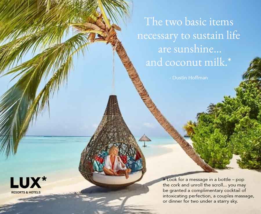
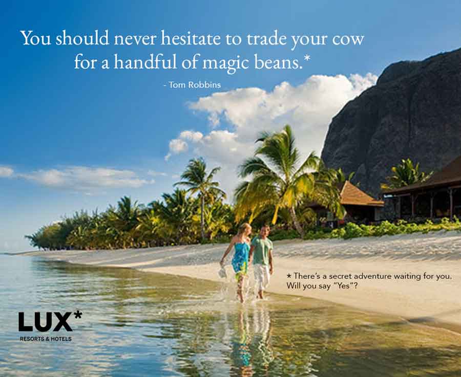
I worked on TOV guidelines for Lux* Resorts (through a branding agency). These resorts in Mauritius, Maldives, Africa, Asia Pacific and the Middle East provide an exceptional and thoughtful experience. Once such exceptional experience is the hidden ‘message in a bottle’, which guests may encounter on a sandy beach, by the pool or under a palm tree. Each bottle has a scroll, with a little ‘gift’, such as a free cocktail or non-alcoholic beverage, a massage or an invitation to a beach dining experience.
BEAUTY ENHANCED BY STORYTELLING
Beauty brands need to connect with their customers in new and authentic ways. Well-crafted stories can enhance your beauty copywriting and improve your customers’ perceptions and experience – which ultimately leads to improved sales and customer retention.
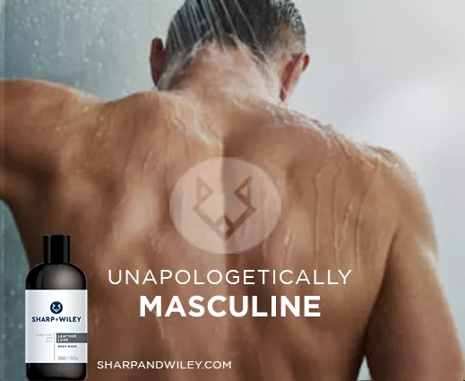
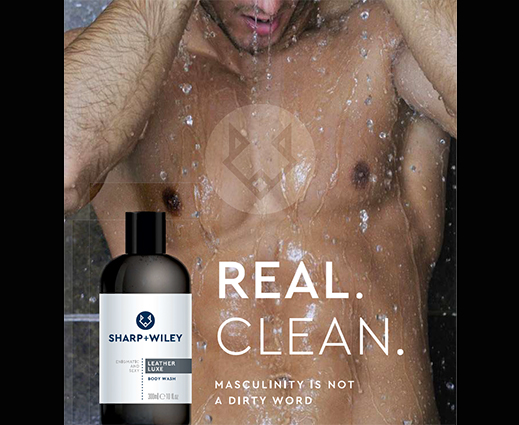
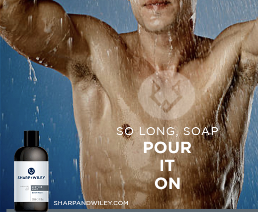
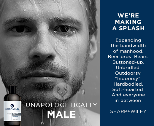
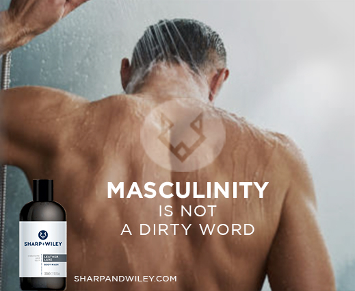
Project: luxury body wash for men. I was approached by an entrepreneur in New York who wanted to launch a new grooming product. He had already named his brand, and was looking for attention-grabbing, somewhat cheeky copy for his male target audience, with gay men as a priority customer persona. I decided we should veer towards unapologetically masculine (though not at all toxic). I wrote extensive brand comms copy, including investor decks and the new tagline: Masculinity is not a dirty word.

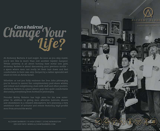
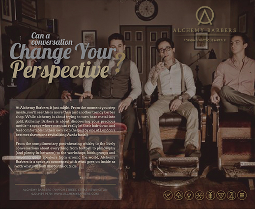
These are additional copy samples for beauty products, including product copy and blogs for luxury beauty products and treatments. The men’s barbershop brand was set up to be a welcoming space where men could hang out, have a beverage and conversation, with an interesting programme of speakers.


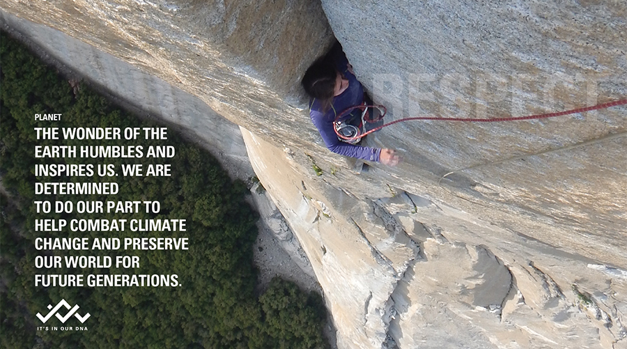
COPY FOR CORPORATE RESPONSIBILITY AND SUSTAINABILITY
I worked closely with global sustainability agency Flag Communications as a freelance copywriter during COVID. I wrote copy for websites, emails, brand development, product naming, concepts for social media content and ads, brochures, corporate responsibility reports, pitches and proposals
I also helped Flag with their own tagline and messaging, working with their creative team on the concept and copy for their homepage video.
Here are a few examples:
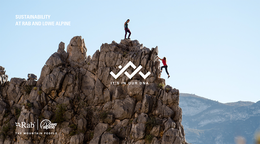
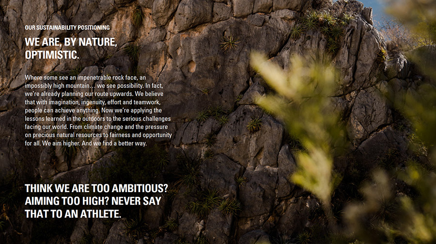
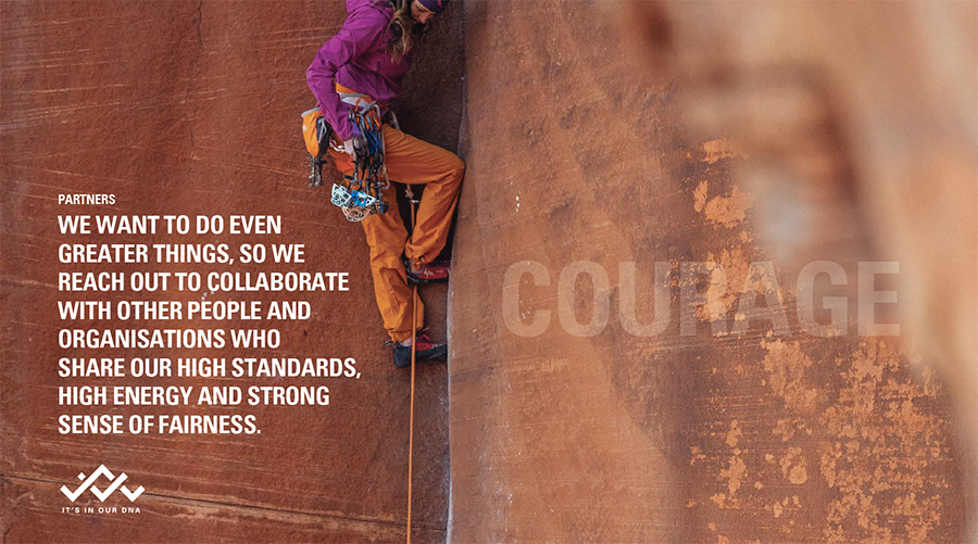
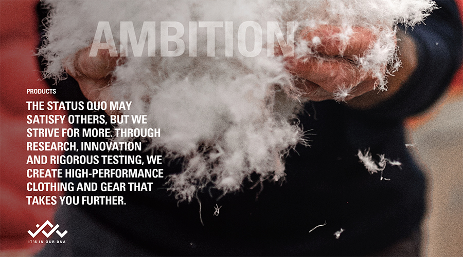
• Brand book highlighting the sustainability ethos and heritage of an outdoor sportswear brand.
I also worked on World Earth Day initiatives, ads for a sustainable paper company, comms around decarbonisation via carbon-neutral cement, comms for sustainable travel events, internal comms on sustainability and responsibility and charity fundraising challenges and events.


• For this sustainable agriculture initiative, I helped produce brand comms, web copy, social content and outreach campaigns to the target audiences (including North American beef ranchers), promoting regenerative farming practices such as cover crops, migrating animals and other soil health initiatives. Benefits can include increased yields, less erosion, a healthier microbiome and more fertile land.
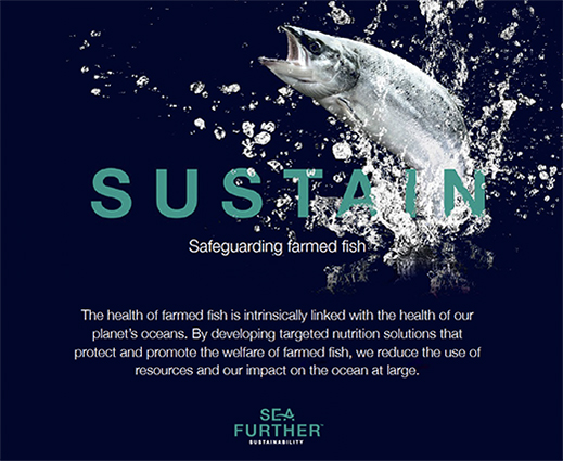
• Promoting more sustainable aquaculture, to help provide nourishing food, with better outcomes for the fish and the local biosphere.
• Promoting more sustainable coffee farming practices, to protect the rainforest and improve workers’ living conditions, with a special focus on empowering female workers.


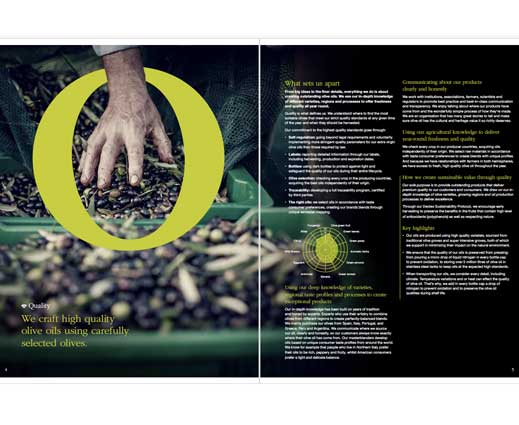
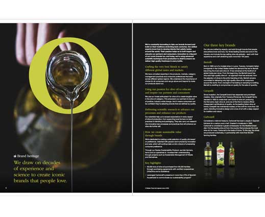
• Proofreading and editing a corporate responsibility report for an olive oil brand.
LONG-FORM PROPERTY WRITING
I’ve worked with property clients from Miami to Montenegro, on brand development, marketing and long-form copy.
For Andermatt Swiss Alps, I worked on brand development across several new residences, as well as copywriting for the ASA brand itself.
This ranged from the naming process to clarifying a unique concept, identity and offer for each residence. I also edited and re-shaped interviews with designers, architects and lifestyle experts, including Patricia Urquiola, Snøhetta, Mortiz Estermann, Miroslav Šik, and Michelin-starred chef Andreas Caminada. I asked further questions, researched details and formulated captivating stories about the inspiration, motivation and articulation of the main concept. I gathered information on specific details, design elements and textures. I also focused on the experiences curated for residents, within the building and in the wider community – from fine dining and luxury shops to skiing, mountain climbing, summer sports and more.


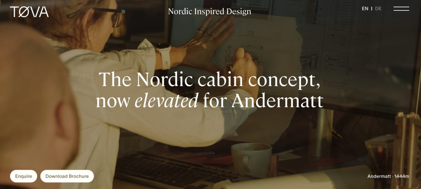


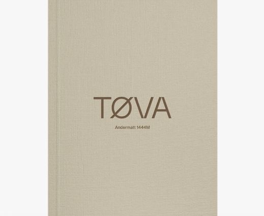
TØVA
I worked with international design agency (based in the UK) Six Design on the brand development for TØVA. I helped shape the story and articulate the inspiration and living experience. In my research, I discovered the Norwegian concepts of friluftsliv or ‘free-air living’ and koselig – the idea that we can embrace the winter and snow, getting outside in nature, then cosying up indoors. This helped inform TØVA’s concept of Nordic cabin living in a sophisticated Swiss Alps context. The hard-bound brochure reads like a long-form article: https://mirandawrites.co.uk/wp-content/uploads/2026/01/Tova_Host-Brochure.pdf
Highlights, including architect interviews/inspiration, shaped by me.
FULL TØVA BROCHURE COPY
MAYA: see long copy here.
MAYA BROCHURE
I worked with international design agency (based in the UK) Six Design on brand development and marketing copy for MAYA. I helped shaped the story of this fascinating collaboration between designer Patricia Urquuiola and Michellin-starred chef Andreas Caminada.
BRAND & MARKETING
I currently work with a UK design agency on Andermatt Swiss Alps, including copy for the main destination and for luxury residences, restaurants, and a new five-star hotel (in progress). I have worked on brand and name development, as well as delivering final copy for websites, brochures and marketing, with detailed descriptions of residences, rooms, furniture and food. This has involved interviews with architects, designers, the developers and chefs, then weaving their insights and philosophy into the brand story, as well as crafting detailed Q&As.
These examples are part of a rebranding for a new five-star hotel and residences in Andermatt. Here, the brand is appealing to people with a sense of adventure, rebellious free-thinkers who carve their own path on pristine snow at sunrise.


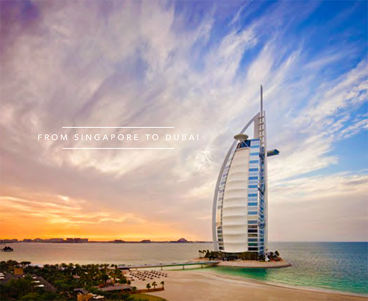
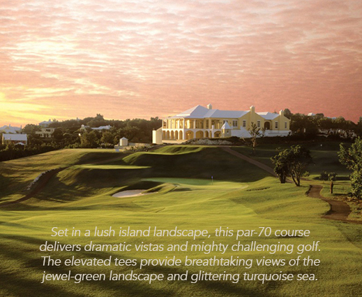
MONTENEGRO
I worked with the in-house marketing team of Luštica Bay for several years, developing high-level brand concepts for new neighbourhoods and residences, as well as ongoing marketing campaigns from social to direct digital marketing. We targeted a variety of international audiences, from HNWI looking for a (or another) holiday home to holidaymakers looking for interesting destinations (as Lustica Bay offers a fully managed lettings service for property owners.
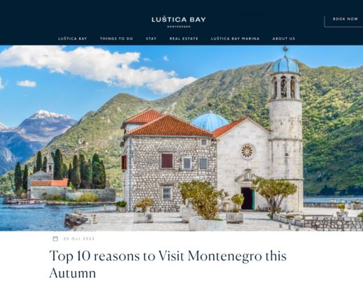
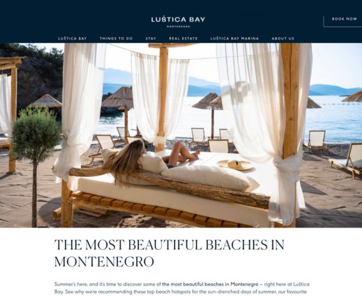
I also wrote SEO-focused blogs about topics from off-the-beaten-track travel adventures to financial incentives for investing in property in Montenegro.
Top 10 Reasons to Visit Montenegro this Autumn
The Most Beautiful Beaches in Montenegro
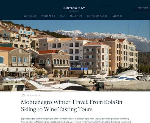
Montenegro Winter Travel: From Kolašin Skiing to Wine Tasting Tours
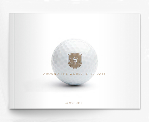
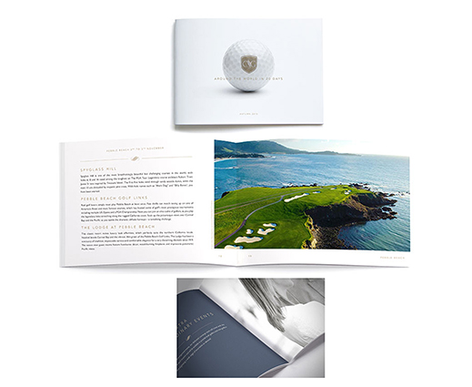
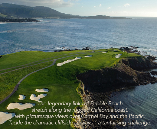
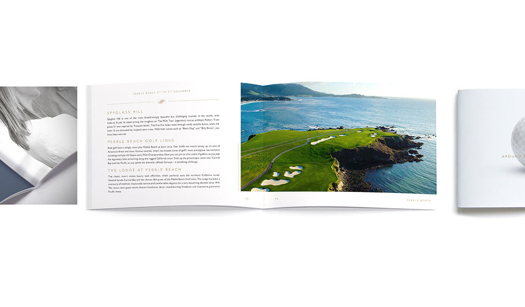
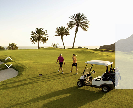
The History of Golf – and Montenegro’s Royal Connection
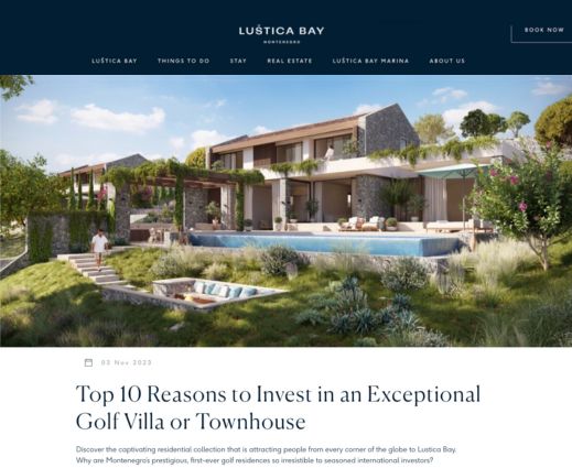
Top 10 Reasons to Invest in an Exceptional Golf Villa
Discover a Waterfront Winter Wonderland
BRAND POSITIONING & MARKETING CAMPAIGNS
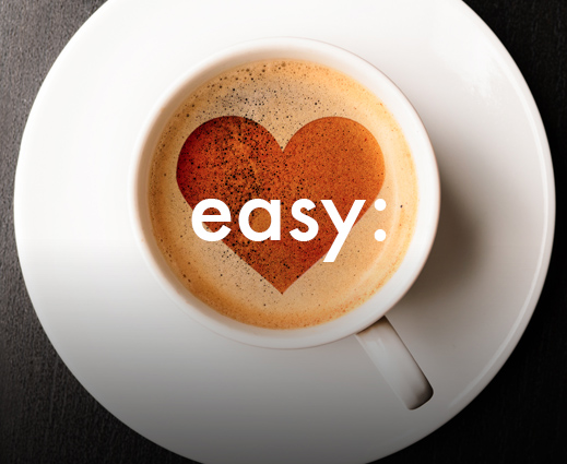
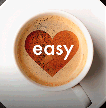
I did a 6-month consultancy as Content Manager with easyProperty, which had recently launched as a low-cost estate agency. I was managing two copywriters, and within two months was also leading the design team. When I arrived, they were leaning into the orange brand colour palette, but were not ‘uplifting’ the brand, as easyJet had done, with vibrant imagery and a more sophisticated approach that counteracts the ‘no frills’ and ‘cheap’ brand promise.
The brief was to improve brand recognition and increase web traffic and conversions. I helped shaped the visuals and created content and ads that played on the ‘easy’ of the title. To increase traffic, we planned and wrote dozens of blogs, many focused on owners of property to let (the major income stream at that time). We researched long-string key word phrases and published intelligent, helpful and legally sound content, measuring results and refining the copy, with measurable improvements in ranking, views, engagement and conversion rates. We also created through-the-door flyers and social content.
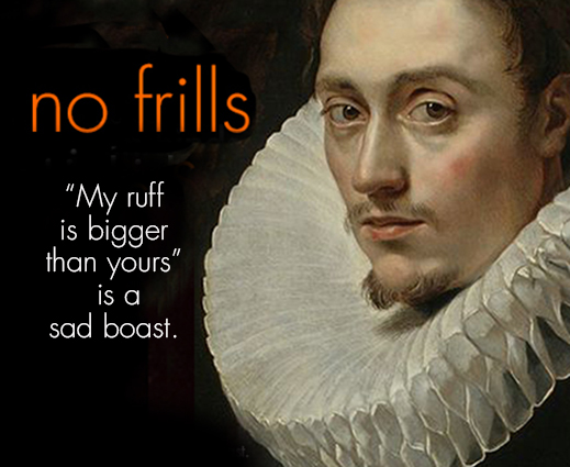
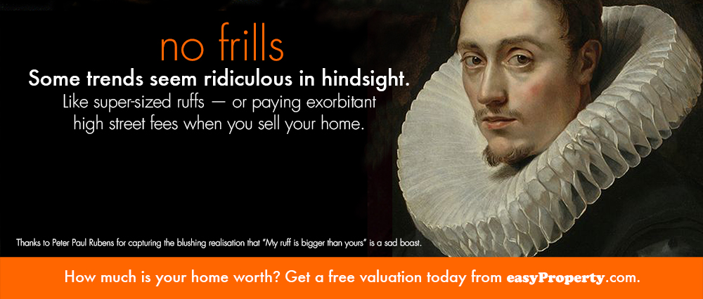
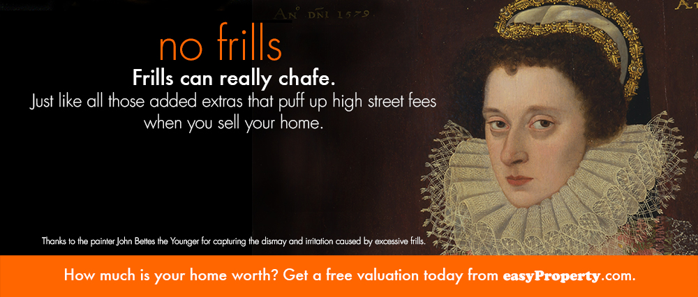
Tube ads: I developed three ads (copy and visuals) as a humour-led way to introduce this new online estate agency (a new concept at the time), with classic fine art lifting the tone and balancing the (somewhat downmarket) ‘no frills’ message with reassuring confidence and attention to detail. There was also an Easter egg: small copy for people standing close to the ads, with added details about the artists’ names, etc.
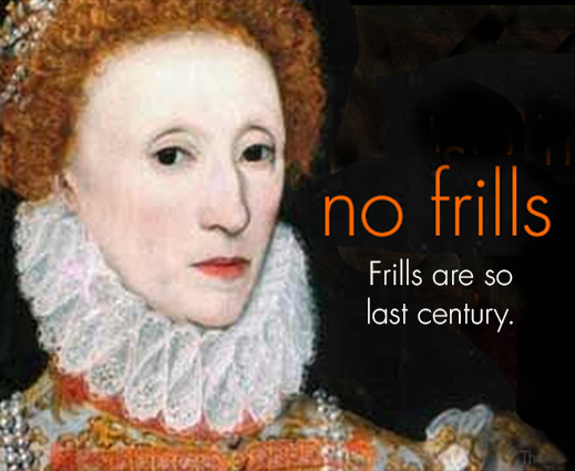
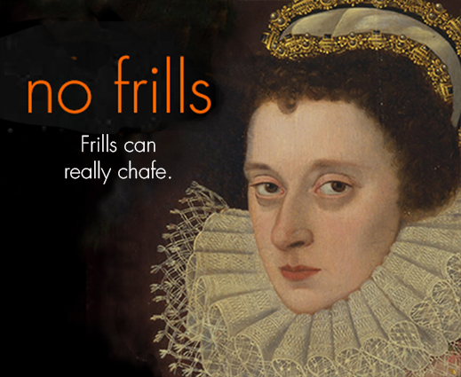

This shows a ‘BEFORE’ and ‘AFTER’ of the website, after refining the look, feel and tone of the brand, to increase emotional resonance and alleviate reservations about going with a ‘no frills’ brand.

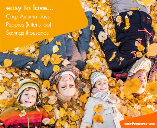
This series of three door drop flyers were designed to introduce the brand in ‘nice’ neighbourhoods, with an upmarket, relatable mailer that yes, showed the orange brand identity, but also felt more sophisticated, to reassure potential customers that this was a reputable agency option. My concept played on the ‘easy’ idea, that listing your home could be simple, straightforward, honest and profitable.


The ‘easy’ campaign again introduced the brand through gifs and videos, playing on the ‘easy’ concept.


These ads were aimed at buy-to-let property owners.


I created a fun little video for socials, promoting the relatability of the brand, while demonstrating the concrete benefits of saving money on agency fees.
TRAINING, POWERPOINTS & PRESENTATIONS
I have developed and conducted brand workshops (including at The Business Show), copywriting lectures at The University of East London and in-house Tone of Voice workshops.
I have a strong affinity for training content, as I worked as a trainer in a non-profit organisation for the deaf in Miami, before becoming Creative Director of a magazine there. We helped new employees understand the mission, boosted the skills of existing employees, and helped hearing employees better understand and empathise with deaf and hard-of-hearing colleagues and customers. This was one of my most fulfilling roles, leading to lifelong friendships and valued mentorships.

")
")